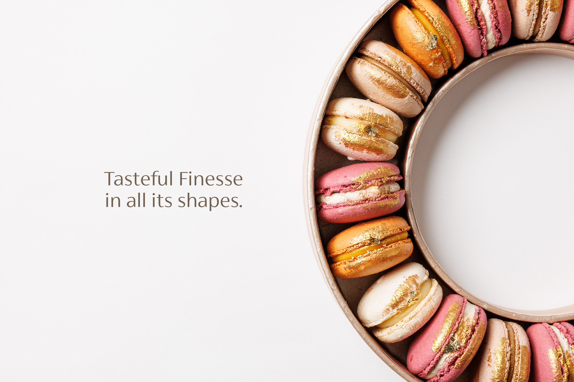
Tasteful Finesse in all its Shapes.

Risen from a magical feeling of finesse, PANNER is a refined pâtisserie shaped by French inspiration and rooted in tradition. It brings back the quiet joy of presence, care, and beauty. Each dessert is created in-house, with intention in every layer — not just to impress, but to move. Behind every gesture is a story, a memory, a bit of soul. In a world that rushes, PANNER offers a pause. A moment to savor. A Maison where emotion becomes ritual, and sweetness becomes meaning.
PANNER Maison
HORECA
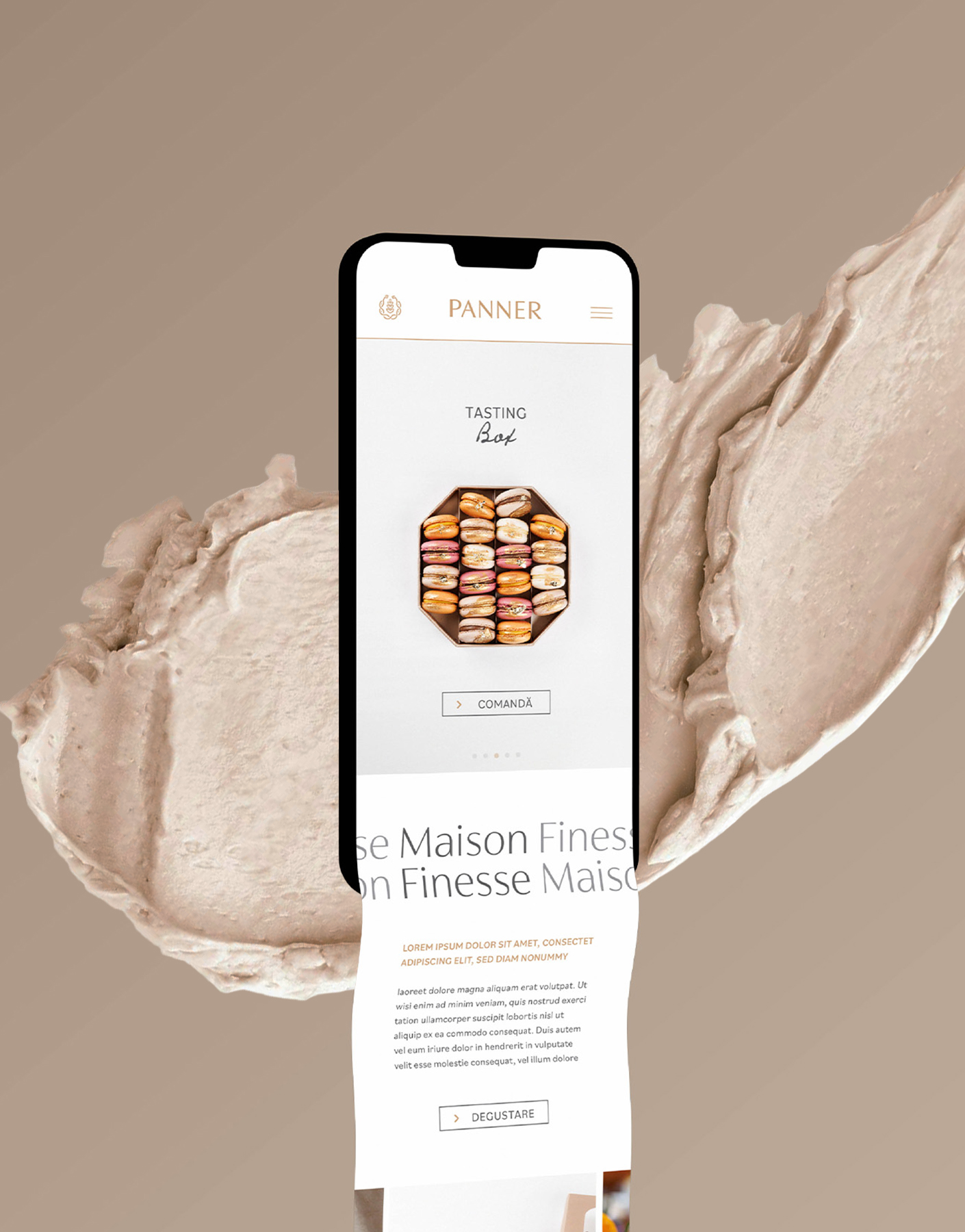
Brand Strategy & Positioning, Branding, Logo Design, Brand Architecture, Digital Design, Website concept, Brand Communication, Brand Voice, Brand Identity Platform
The challenge was more than just designing a brand — it was about witnessing and guiding its becoming.
From its early days as an artisanal bakery to the refined expression of pâtisserie it is today, PANNER’s journey has been one of evolution, not reinvention. Together, we shaped its story from the ground up — building a foundation rooted in warmth, craft, and authenticity, then elevating it into a Maison of finesse.
This was more than a rebranding. It was a long-term collaboration built on trust, shared vision, and attention to detail — from naming and tone of voice to product rituals and seasonal campaigns. In a growing market like Brașov, where tradition meets contemporary taste, PANNER has become a point of reference.
Our role was to ensure the brand identity could hold both the emotion of its origins and the clarity of its direction. Together, we gave the brand room to grow — without ever losing what makes it deeply human.
.jpg)
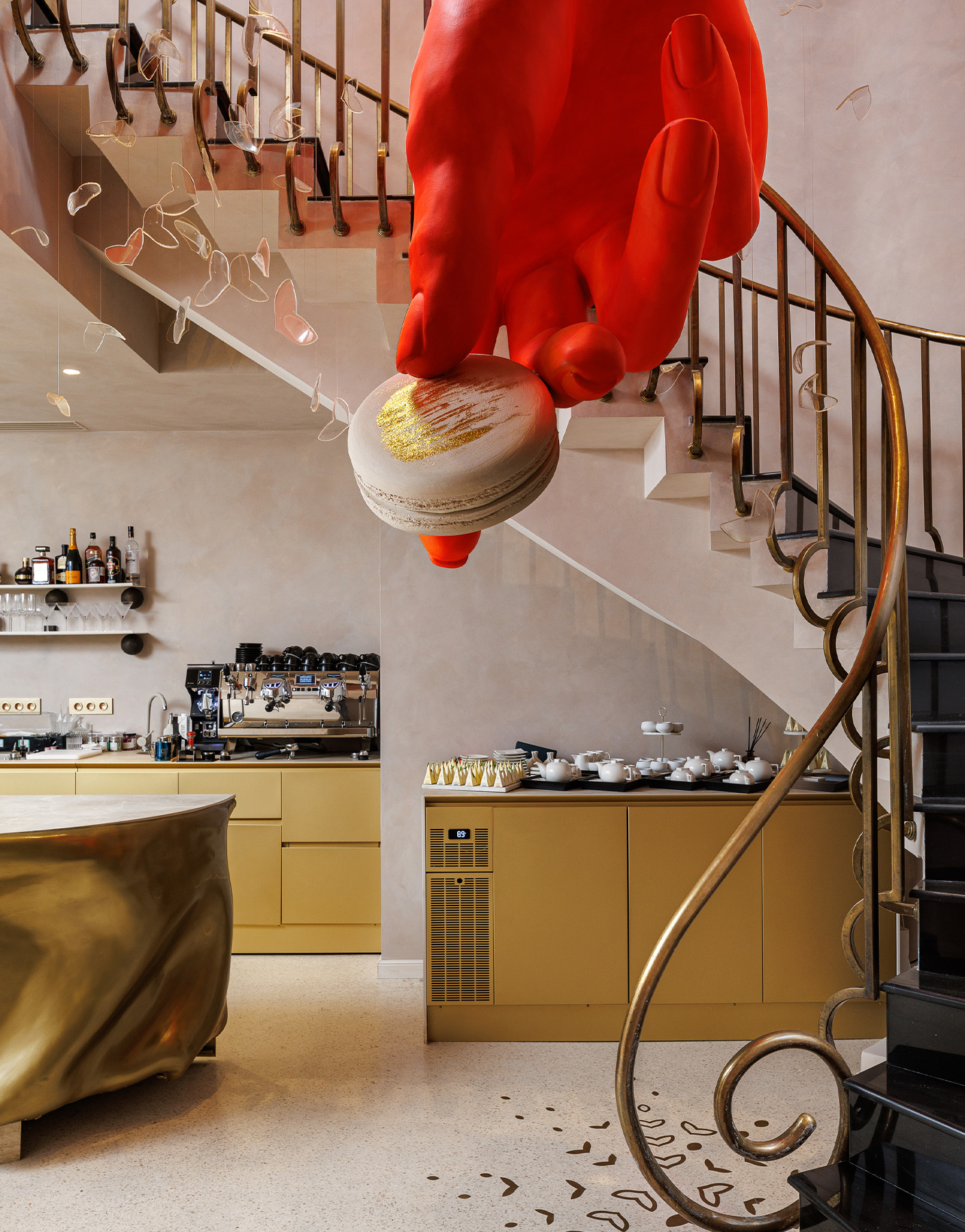
.jpg)
PANNER has always been about more than taste — it’s about presence.
Our process began with honest conversations with the founders, Remus and Georgiana — two people whose quiet ambition and deep emotional intelligence shaped not just the brand, but the experience around it. What we uncovered was essential: PANNER is not simply a place, but a feeling. A Maison in the truest sense — where craft meets soul, and where every detail speaks with care.
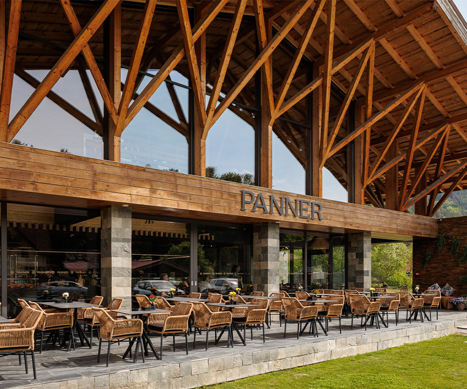
From the original Mont Maison in Bran to the elegant Maison Finesse in Brașov, PANNER’s journey has remained slow, deliberate, and emotionally grounded. It doesn’t chase trends — it cultivates meaning. And it invites others to pause, savor, and remember.
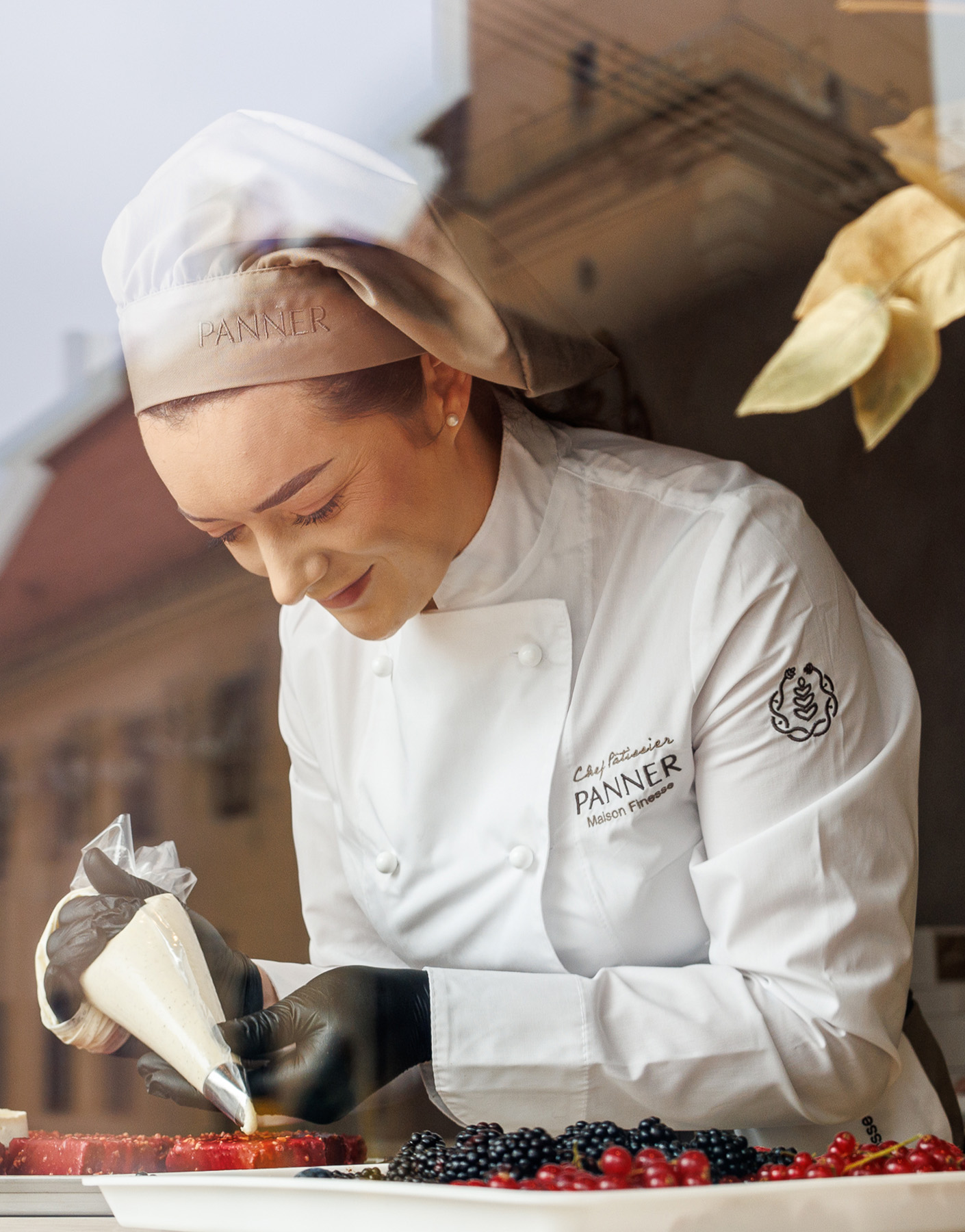
Our role was never to invent, but to reveal — to translate the soul of PANNER into a clear, elegant identity that could grow without losing its intimacy. We worked across all dimensions: visual language, tone of voice, naming, product storytelling, seasonal campaigns, and customer rituals. Each element was crafted like a pâtisserie: layered, thoughtful, and emotionally resonant.
From the handwritten notes to the Maison names, from campaign lines to Click & Collect labels — every gesture was treated as an invitation. We built an identity system that feels both timeless and alive. Not loud, but memorable. Not polished for the sake of polish, but designed to hold warmth and clarity.
This wasn’t just branding. It was about building a space — a Maison — where people feel something they don’t quite have words for.
PANNER is shaped by presence — the kind that takes time, pays attention, and leaves something behind. At its heart lies a gentle yet powerful archetype: the Caregiver, with nuances of the Creator. A brand that gives, builds, and tends. Not to impress, but to nourish — through beauty, intention, and soul.
From the beginning, everything about PANNER was designed to feel. The name itself carries softness and clarity, anchoring the brand in artisanal heritage while opening space for refinement.
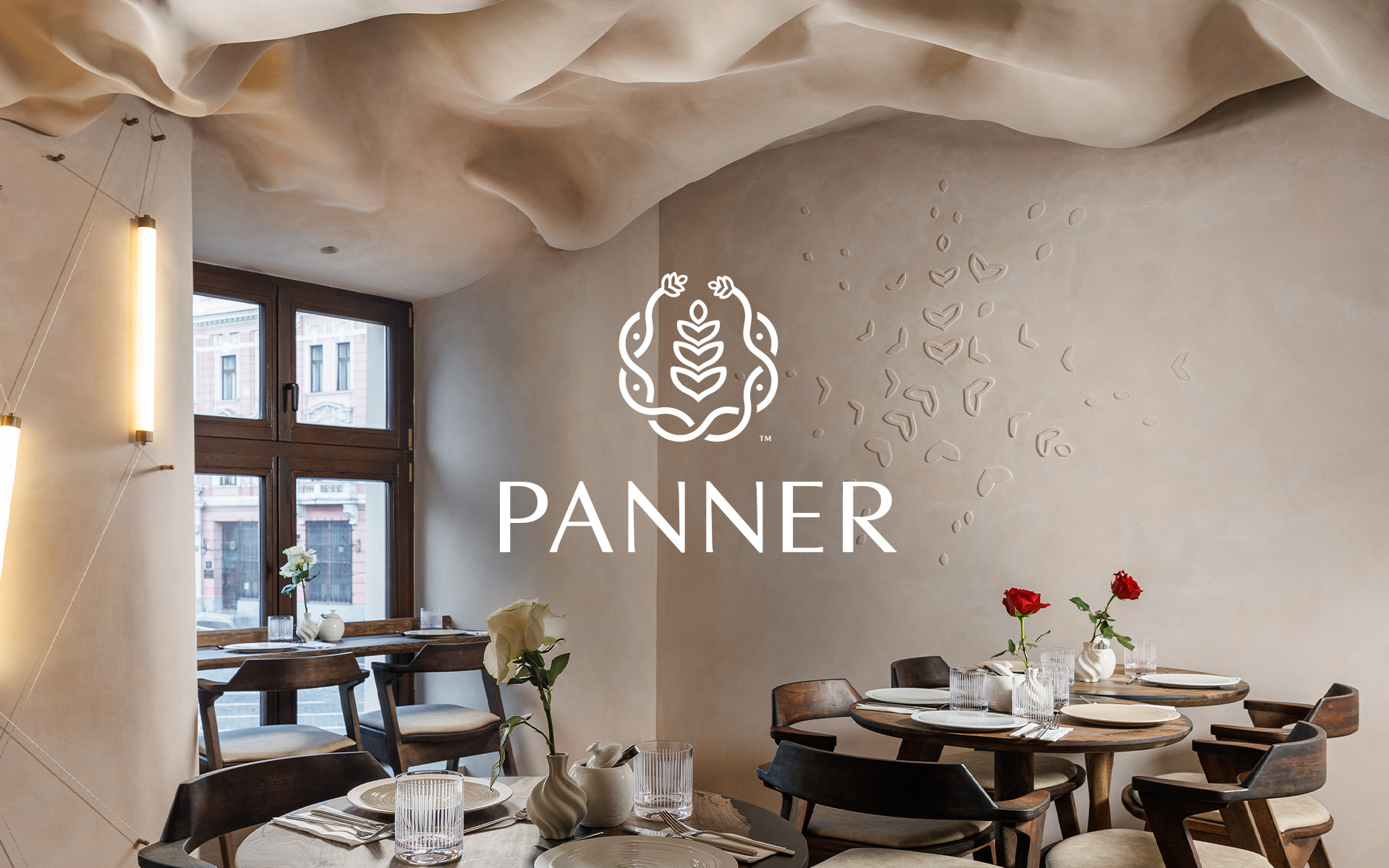
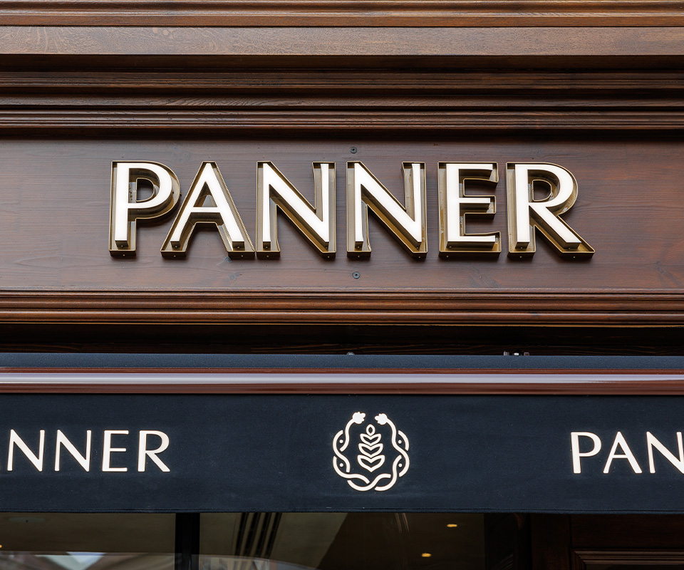
The visual identity followed that same path. The logomark, in particular, became the most distilled expression of the brand’s soul. Its delicate shape holds layers of meaning — a gesture of openness, a trace of wheat, a petal in bloom, a pair of hands offering. Rooted in craft, nature, and emotion, the symbol reflects what PANNER is at its core: a Maison that grows with grace and gives with presence. A quiet elegance in motion.
We paired this with a typeface that balances function and finesse, and a color palette inspired by its landscape — the softness of mountain air, the calm of early light, the warmth of flour and wood.
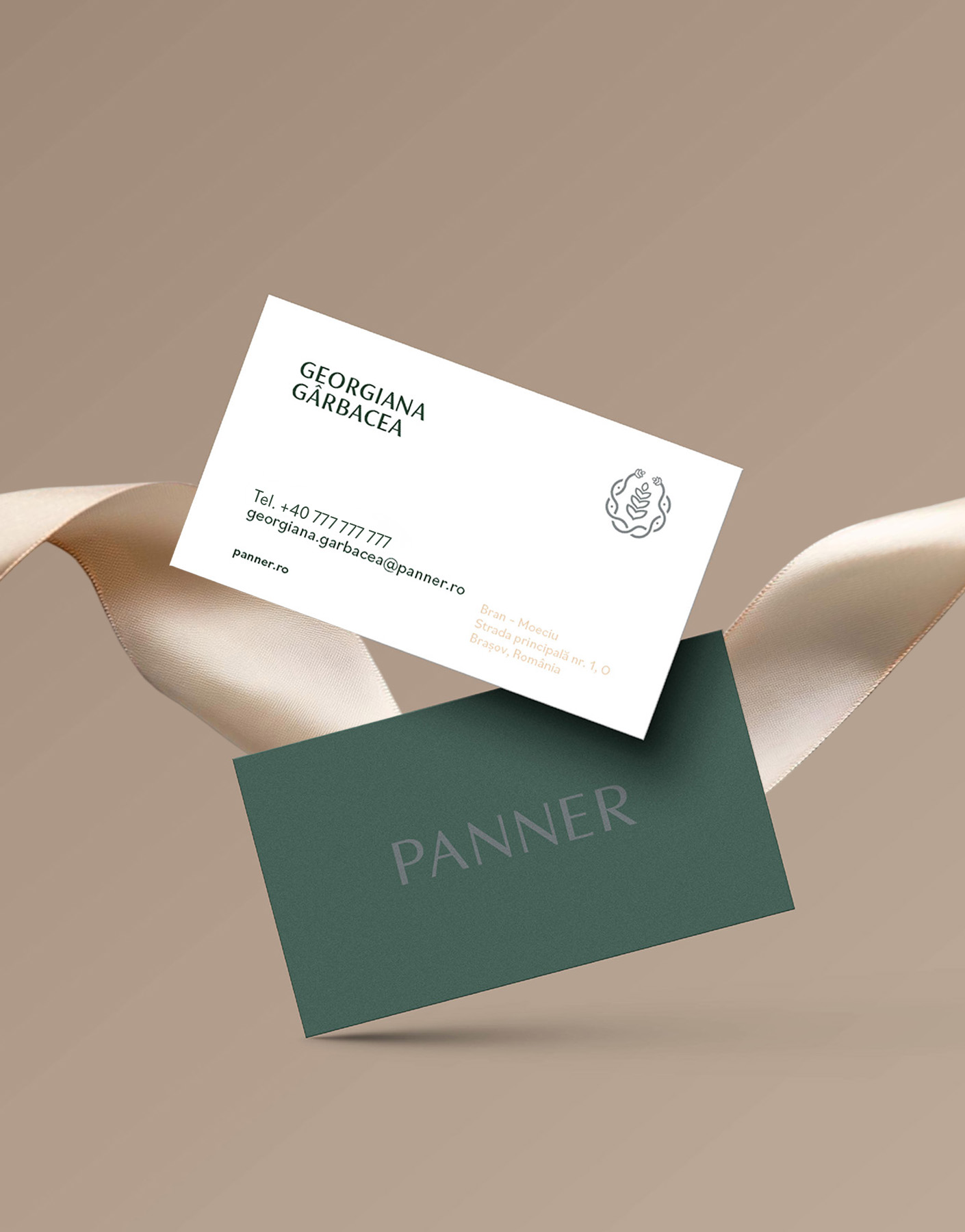
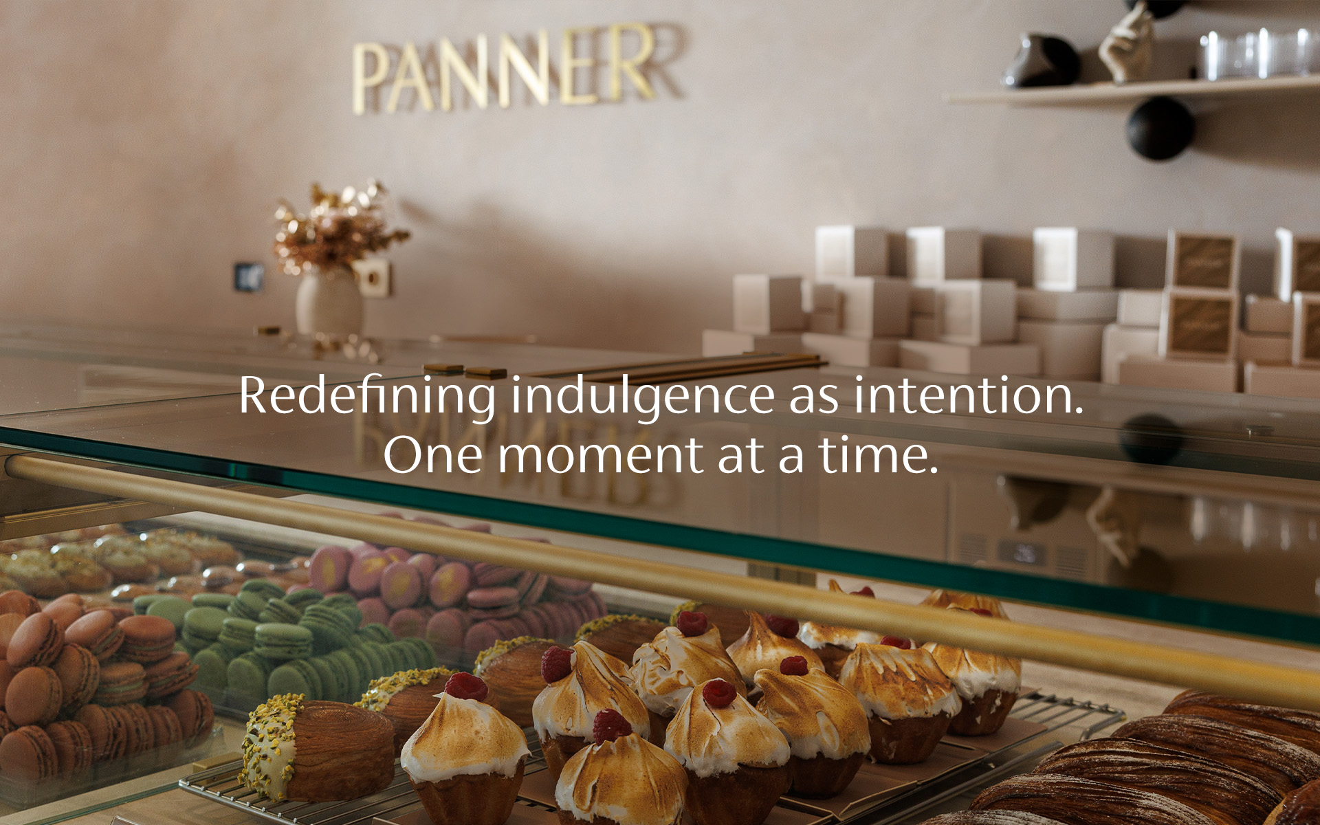
Its packaging, too, tells a story: of subtle textures, thoughtful finishes, and restrained design choices that invite people to hold, open, and linger.
In communication, PANNER never raises its voice. It speaks softly, but it reaches deep. Through handwritten notes, poetic menus, and seasonal rituals, it creates a world that feels lived in, intimate, and memorably human.
The legacy PANNER builds is one of care. Of creating with meaning and offering with grace. It doesn’t rush to scale, but chooses to deepen — its products, its spaces, its relationships.
As partners, we at Brandis were not only observers — we were co-authors. We helped shape the language, the emotion, the story and the systems. From the first product names to every brand campaign and touchpoint, we grew alongside the brand, ensuring its soul was never lost in the process of refinement.
PANNER is more than a Maison. It’s a way of seeing the world — where presence is the real luxury, and where sweetness becomes a quiet, lasting kind of strength.